Skeletons
In our component library there are various skeleton components, such as <zui-skeleton-rectangle> or <zui-skeleton-circle>.


These components can be used, for example, to create completely customised skeleton layouts. Furthermore, it is possible to use them in our components. In the styleguide it is not possible to use skeletons in all components, therefore we only support the following components.
Components which support skeletons
- Table
- Thumbnail
- Title Stack
- List
- List Accordion
- Content Tab Bar
- Avatar
- Chat item
- Content Accordion
- Section Divider
In some other components it is still possible to add skeletons and the skeletons can also be used flexibly in the applications in other places.
How to use Skeletons in this Components
For each of the components above, there is an extra example in the documentation and in the storybook to show how skeletons can be added to the component. In general we added skeleton slots to the components at the appropriate places they are only available if the content of the slot which should displayed as skeleton does not contain anything or the corresponding attribute has not been set. To add a Skeleton instead of the content a skeleton component can be added to the corresponding slot. The names of the slots are as follows: Skeletons that can be added instead of the default slot are added to the slot named skeleton. For named slots the name is appended at the end and for attributes (we have to discuss that)
- default slot -> slot: skeleton
- slot: header -> slot: skeleton-header
- attribute: label -> slot: skeleton-label
Currently, to replace text with a skeleton the <zui-skeleton-rectangle> must be used and the correct text height and width in pixels must be set on the component.
In the future there will be another skeleton component that automatically determines its height depending on the font set.
Special case skeletons in default slots
In components where content of the default slot should be displayed as a skeleton we add into the default slot the custom skeleton slot as fallback. When nothing is in the defaultslot the skeleton is displayed. The limitation here is that default slots can contain line breaks and spaces from the markup. As soon as there is a space in the default slot, the skeleton is not displayed. This is a known limitation and can be avoided by adapting the markup.
Title stack with line breaks
  <zui-title-stack size="s" label="label">
        <zui-skeleton-rectangle
            slot="skeleton"
            style="--zui-skeleton-rectangle-width: 170px; --zui-skeleton-rectangle-height: 29px">
        </zui-skeleton-rectangle>
        <zui-title-stack-meta-item slot="meta">
          <zui-skeleton-rectangle
            slot="skeleton"
            style="--zui-skeleton-rectangle-width: 170px; --zui-skeleton-rectangle-height: 19px">
          </zui-skeleton-rectangle>
        </zui-title-stack-meta-item>
  </zui-title-stack>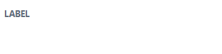
Title stack without line breaks
<zui-title-stack size="s" label="label"
          ><zui-skeleton-rectangle
             slot="skeleton"
             style="--zui-skeleton-rectangle-width: 170px; --zui-skeleton-rectangle-height: 26px"
          ></zui-skeleton-rectangle
          ><zui-title-stack-meta-item slot="meta"
            ><zui-skeleton-rectangle
              slot="skeleton"
              emphasis="subtle"
              style="--zui-skeleton-rectangle-width: 200px; --zui-skeleton-rectangle-height: 16px"
            ></zui-skeleton-rectangle></zui-title-stack-meta-item
        ></zui-title-stack>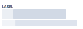
For more informations read Templating into default slots